# Gallery
Gallery contains the list of interactive components that can be added to the slide.
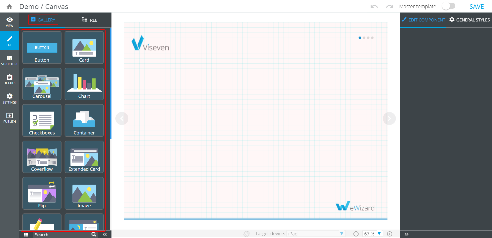
To add the component to the slide, click the component icon.
To add the new component into another component:
Select the container where the component should be added to.
Click the necessary component in the
Gallery.
Components' text properties are configured with WYSIWYG.
For faster and easier search of a component, use Filter ( ) and
) and Search fields.
# Button
Button is an interactive component that includes Text component and has the following Properties:
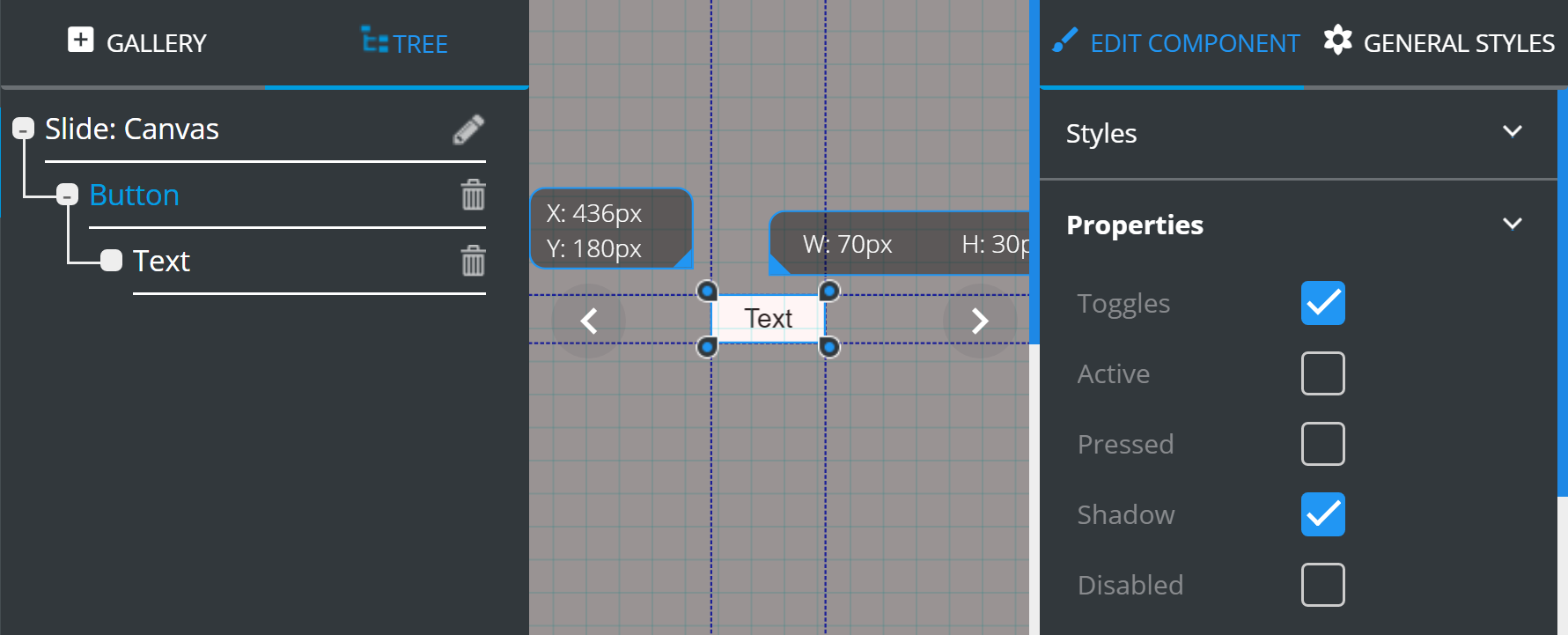
Toggles– if enabled, the button flips back to active state with each tap.Active– defines the initial button state as active.Pressed– defines the initial button state as pressed.Shadow– if enabled, adds shadow to a button (when pressed).Disabled– if ticked, all of the above visual indicators of interaction with the button are no longer applied.
# Card
The Card component includes Image and Text components. It is also used as a constituent component of other complex elements, usually as a Collection item.
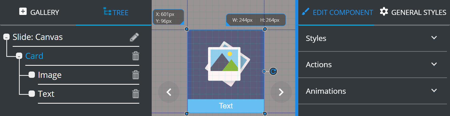
Card can be attributed with Styles, Actions and Animations that are described in EDIT COMPONENT tab.
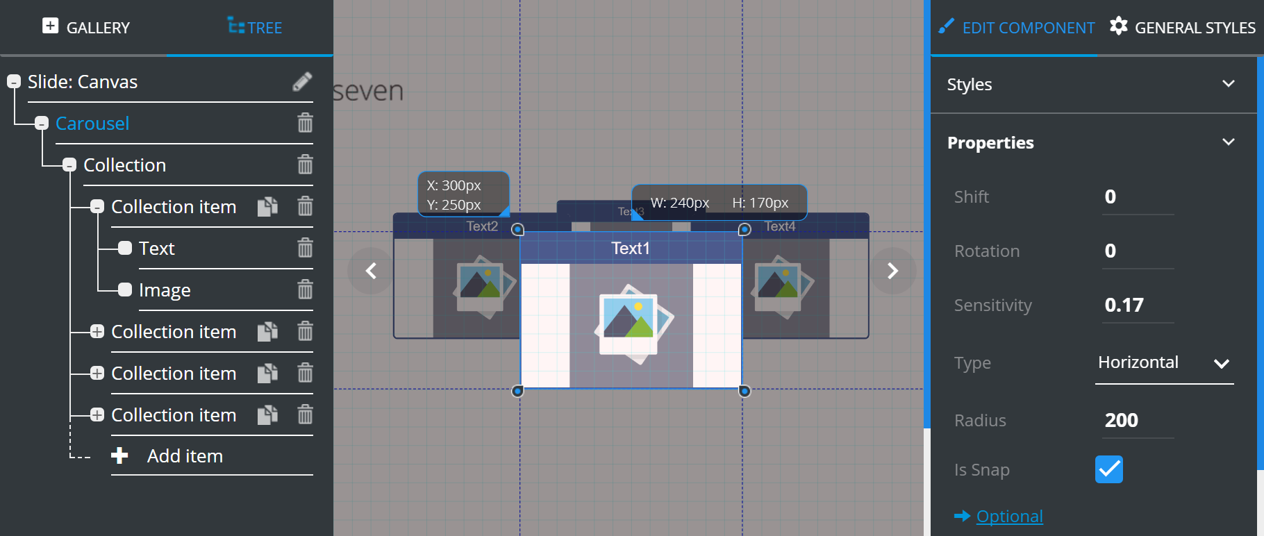
# Carousel
The Carousel is an interactive gallery which items can be revolved. The component includes an adjustable number of Cards (Collection item):
The component items management is described at the TREE chapter.
The Apply to all items feature is described at the EDIT COMPONENT chapter.
Carousel holds the following Properties:
Shift– horizontally shifts the selected section in relation to the rest of the Carousel.Rotation– initial rotation angle in ranging from 0 degrees to 360 (0 by default).Sensitivity– rotation speed multiplier (0.2 by default).Type– defines carousel rotation type (horizontal/vertical).Radius– carousel rotation radius (300 by default).Is snap– if enabled, this setting makes your Carousel card settle squarely in the center once rotation is complete; if disabled, your Carousel would stop wherever you pulled your finger off it when rotation was complete.
Optional contains additional features, which can be customized according to your requirements:
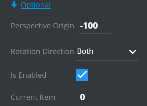
Perspective origin– defines the value of "perspectiveOrigin" style property for carousel element. This property allows you to change the bottom position of 3D elements (90 by default)Rotation direction– defines available directions of carousel rotation.Is enabled– defines if carousel is enabled for interaction (true by default).Current item– defines how far you can rotate the Carousel in one go.
# Chart
Chart is an interactive component that adds charts to presentation slides.
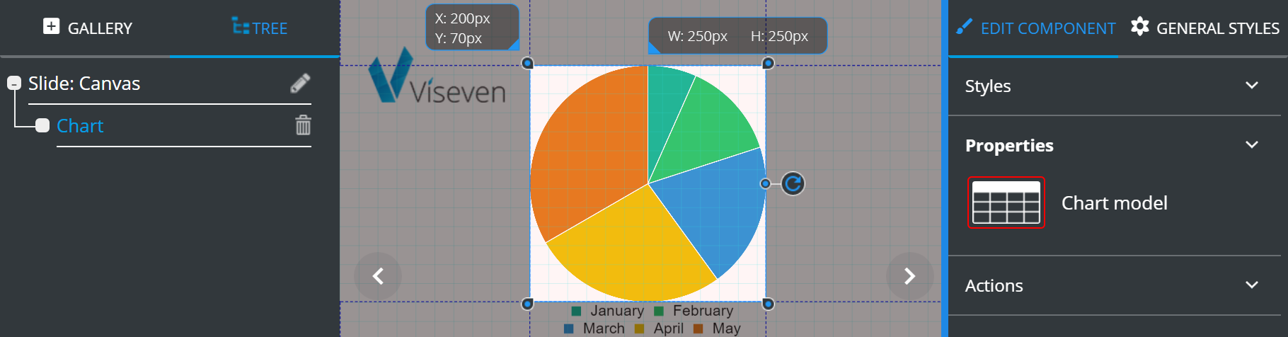
The Properties of the Chart contain Chart model that opens the extensive settings:
1.Chart types.
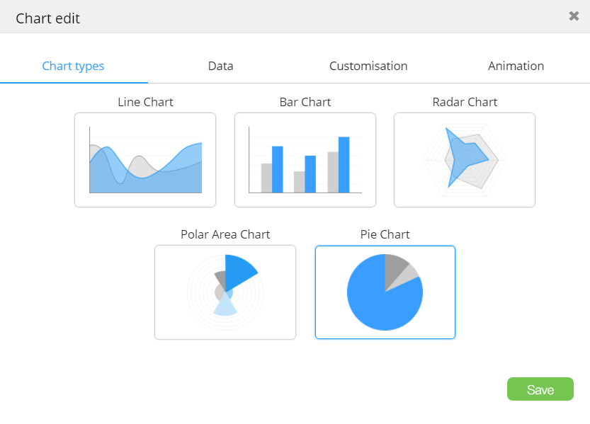
Data– values for columns or divisions.
To add a new column to the chart, click  .
.
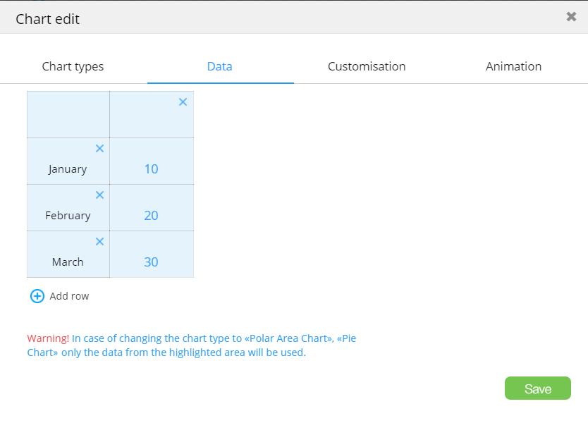
Customizationallows selection of divisions/column number and color.
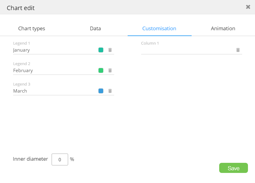
Animationallows customization of animation used to render the chart.
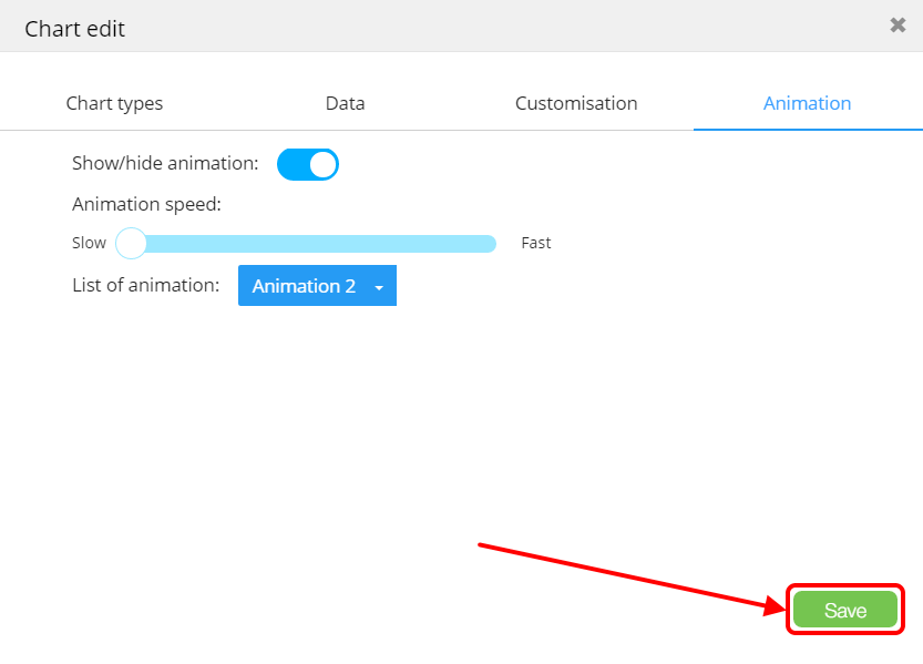
To save all changes, click Save.
# Checkboxes
Checkboxes is an interactive collection of the Checkbox items:
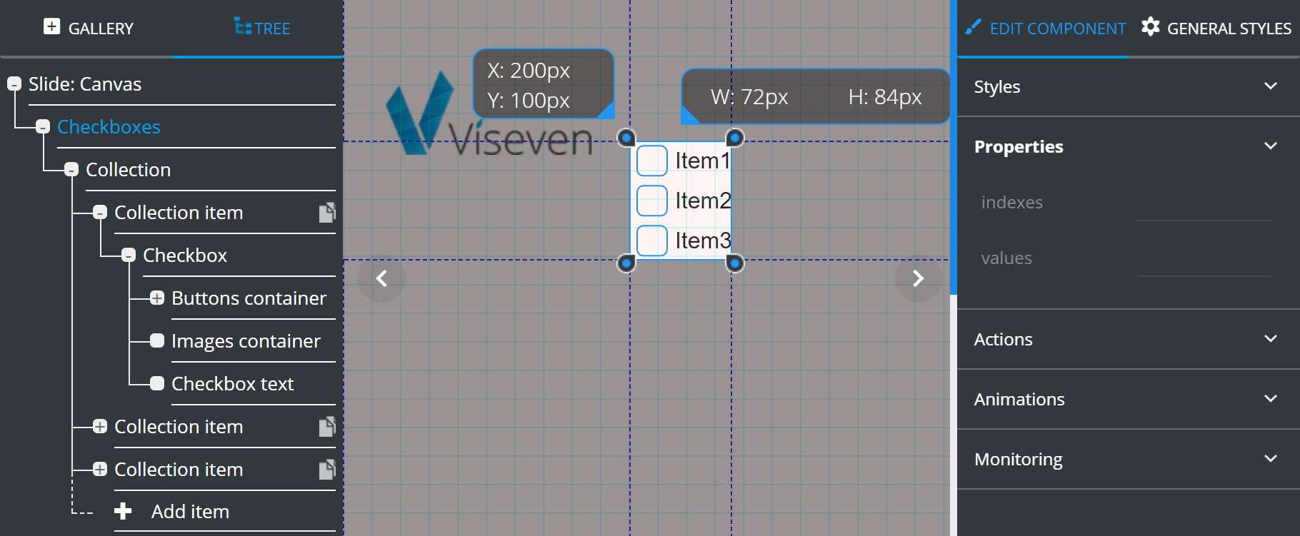
The Properties of the Checkboxes (root container of the component) shows summary of the component current state (indexes of the selected items and their values) and doesn't allow to set any values.
The component items management is described at the TREE chapter.
Each Checkbox has the following Properties:
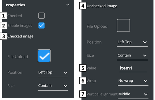
Checked– defines the initial state of theCheckbox.Enable images– allows to use custom images instead of standard checkboxes.Checked image– defines the checkboxImagesettings for the "checked" state.Unchecked image– defines the checkboxImagesettings for the "unchecked" state.Value– value that will be used for monitoring collection as the name of the particular checkbox.Wrap– determines the ability to wrap checkbox text.Vertical alignment– vertically aligns text position.
# Container
Container is a blank unified component used as a "wrapper" for other elements (can contain other components).
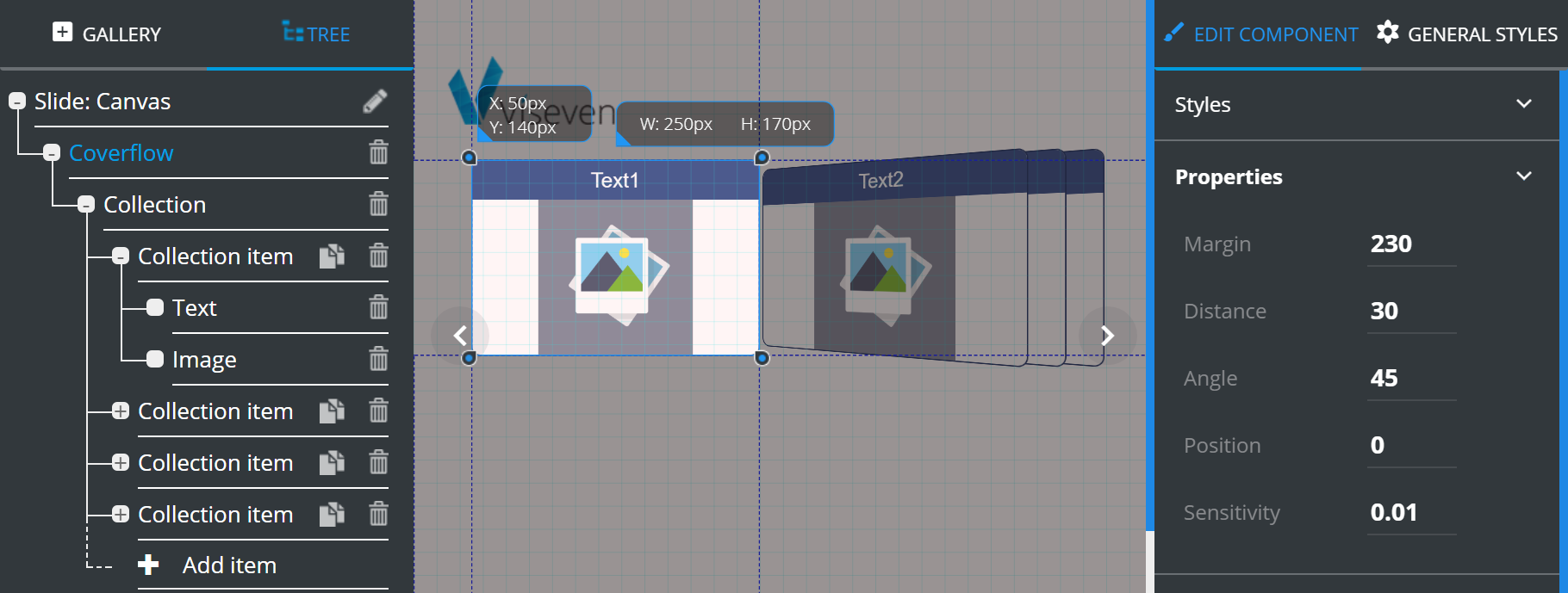
# Coverflow
The Coverflow is an interactive gallery where you can smoothly flip between items. The component includes an adjustable number of Cards (Collection item):
The component items management is described at the TREE chapter.
The Apply to all items feature is described at the EDIT COMPONENT chapter.
Coverflow has the following Properties:
Margin– defines the distance between the active card and the others ones.Distance– defines the distance between the stacked cards.Angle– defines the angle at which the inactive cards are turned away from the center.Position– specifies which of the sections takes the central position by default.Sensitivity– defines the speed of switching between "Card" elements.
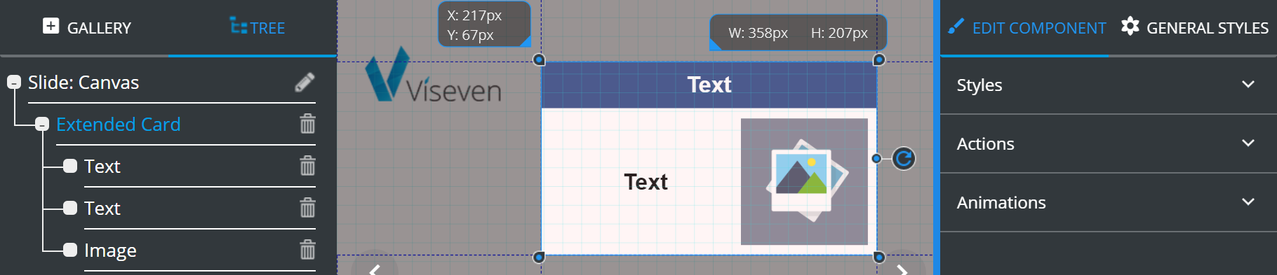
# Extended card
Extended card is an advanced version of Card that includes additional Text component in the data area (aside the image):
# Flip
Flip is an interactive component that contains two Containers with Extended card and Image in each of them. Images are used as buttons for switching between Extended cards.
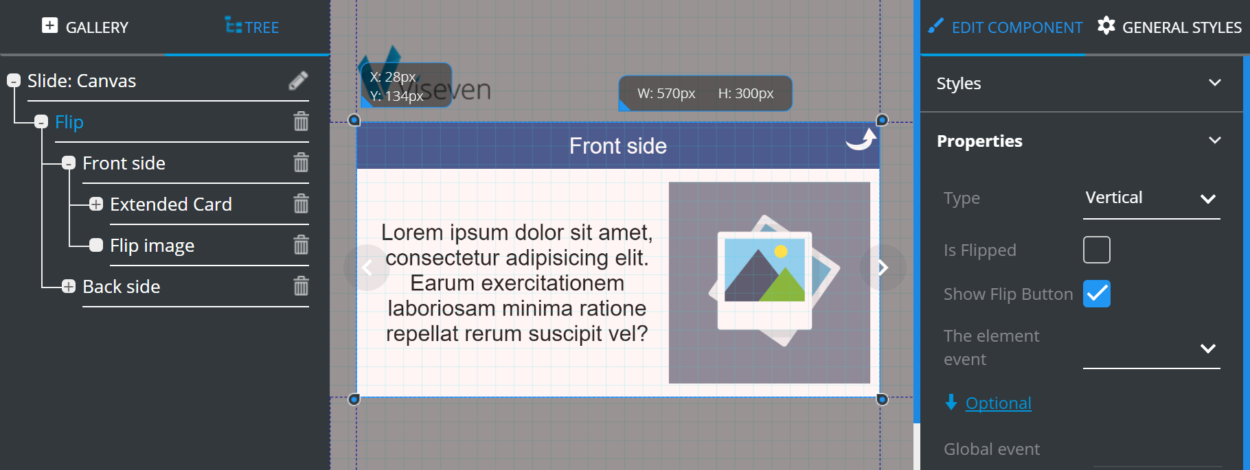
Flip contains the following Properties:
Type– defines flip direction (horizontal/vertical).Is Flipped– defines the initial card position (flipped/not flipped).Show flip button– if enabled, the flip button will be displayed.The element event– defines the event which will trigger the flip.
Optional contains additional features which can be customized according to your requirements:
Global event– here, you can insert a command to initiate the flip. The inserted command will be assigned for the entire slide (i.e. if you insert "tap", the flip will be performed by tapping on any slide area).
# Image
Image is a basic component designed for adding images to the slide. It is mainly used as a constituent component of other elements. It also contains tools for image editing.
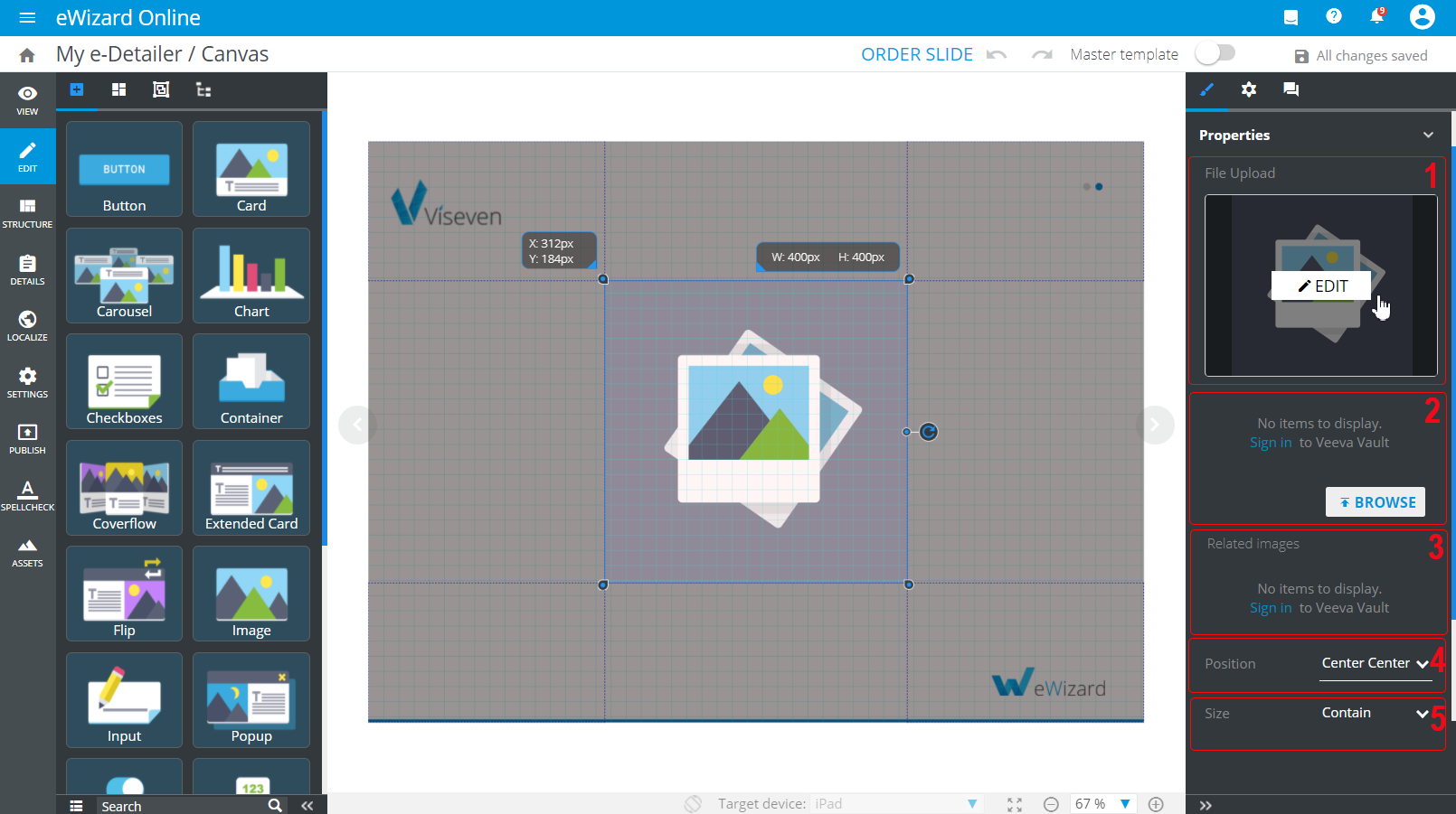
Select the image component on the layout and unfold the Properties tab on the tools panel. Here you can find:
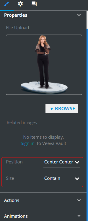
[1]: File upload that allows you to upload images from Assets or Veeva Vault via BROWSE, as well as go to the Edit image pop-up via EDIT.
The Digital assets pop-up features autocompletion of fields. The keywords previously entered for image search are saved for further work within a particular e-Detailer. Also, when you select an image on the layout, you can find its metadata already loaded to the appropriate fields.
[2]: The optional images block that contains multiple Veeva Vault assets. To add several images to the layout per time, do the following:
Click
BROWSE. This redirects you to theDigital assetspop-up.Go to the Vault tab and if required, sign in to your account.
Select the checkboxes of the images you want to add to the item.
Click
Select:
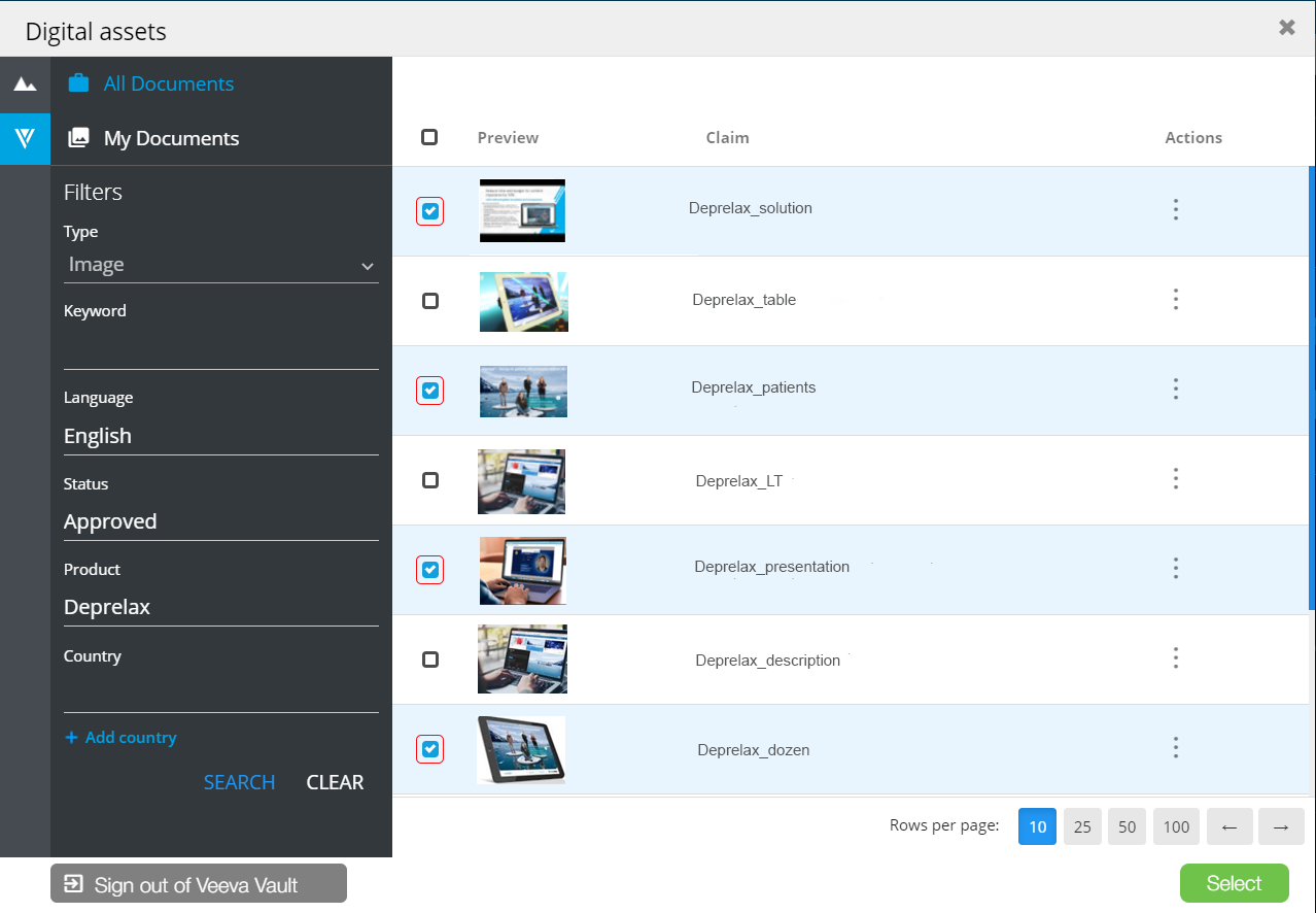
As a result, all the images are grouped in one collection under the image placeholder:
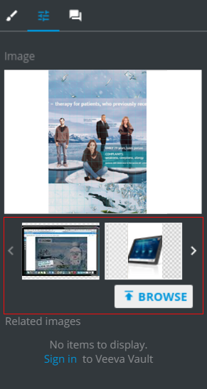
[3]: Related images that contains connected images, if any, with the one you uploaded from Veeva Vault. In the target system, these images are added to the alternative components section. In e-Detailer Editor, you can use them to fill any image components on the layout without iterated requests to Veeva Vault.
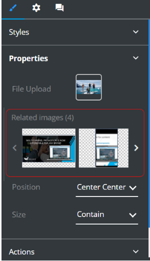
[4]: Position that defines the image position relative to the container (doesn't work if Size is selected as "Cover"):
[5]: Size that defines image sizing to fit the container:
# Input
Input is a simple interactive component that is mostly used as a component of more complex elements and serves for data input. It opens up a field where you can type text which is then saved in the reports.
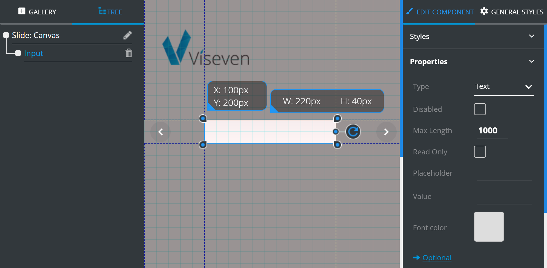
Input has the following Properties:
Type– defines the type of information to be entered.Disabled– if ticked, the interactive element becomes disabled.Max length– defines the maximum number of symbols that can be entered.Read only– if enabled, makes the Input element unavailable for editing.Placeholder– this field is intended for entering user instruction to show in the field before the user enters the actual text (E.g. Please type your age here).Value– here you can enter an example of the answer you need people to enter in the field (E.g. 35).Font color– defines the font color.
Optional contains additional features which can be customized according to your requirements:
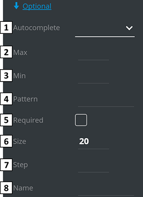
Autocomplete– turns on/off the autocomplete.Max– if Type is set to "number", any value higher than max will be considered invalid.Mix– if Type is set to "number", any value lower than min will be considered invalid.Pattern– regular expression which is used to validate the value.Required– if marked, the Input field becomes obligatory.Size– defines input width in characters.Step– if Type is set to "number", it is possible to set the number value of current value change.Name– Input naming for Monitoring setup.
# Pop-up
Pop-up is an interactive slide component. It allows to access additional information on-demand without slide overloading.
To use the pop-up component, assign the pop-up opening to the specific action.
For example:
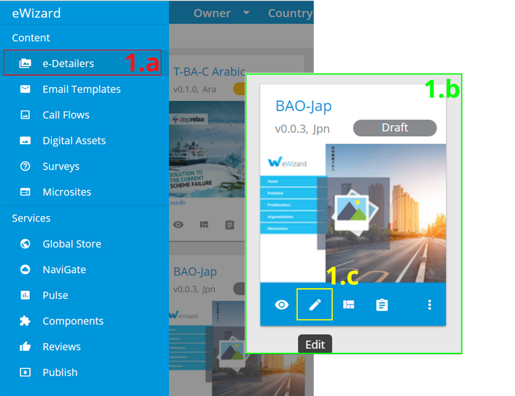
Open an e-Detailer for editing.
a. Go to the
e-Detailerssection of eWizard.b. Pick an
e-Detailer.c. Click
Edit .
.
Open the required slide.
Add the pop-up component
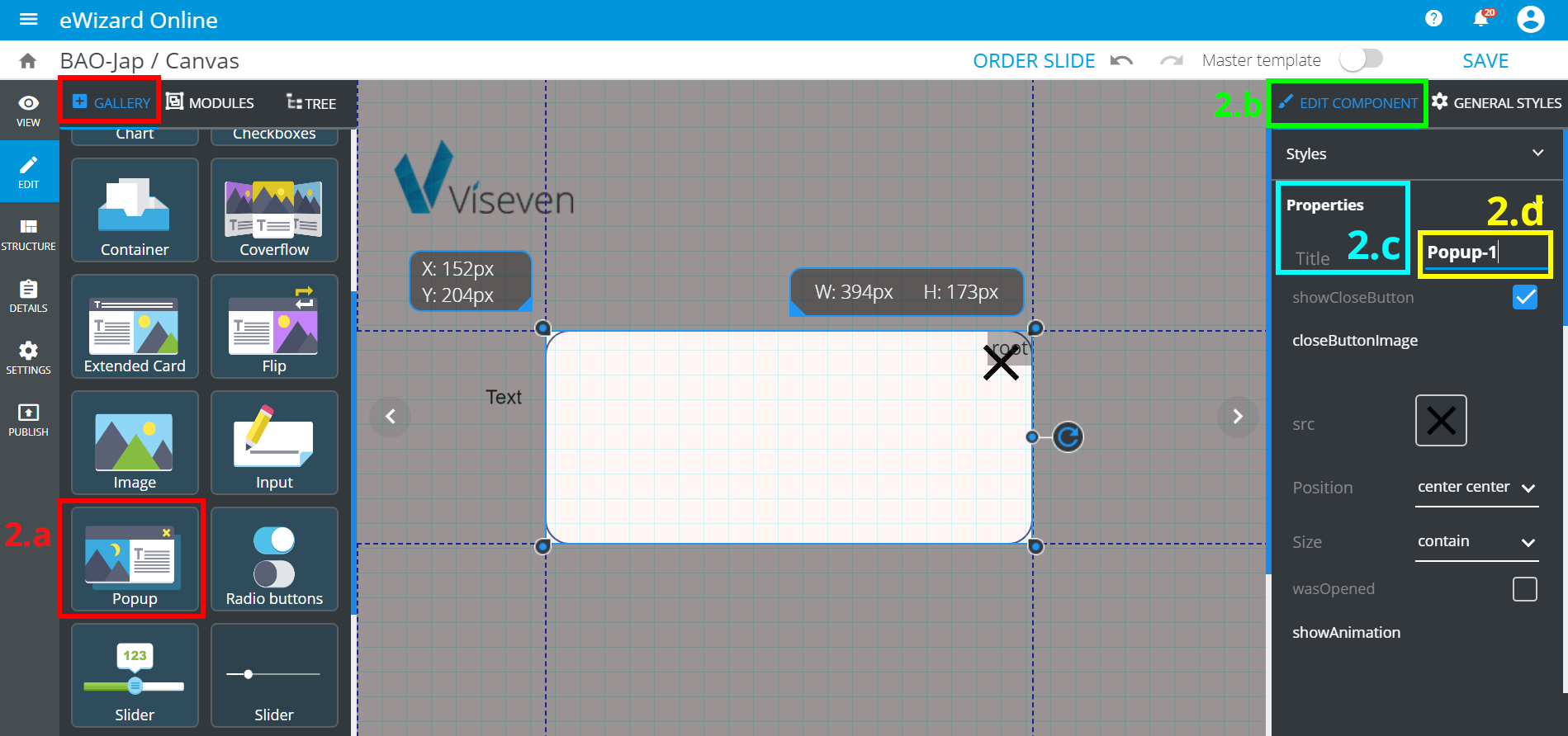
a. Find
Pop-upin theGalleryand click it.b. Go to
Edit component.c. Unfold
Propertiesand findTitle.d. Set up the title for your pop-up.
Assign the pop-up opening to another component.
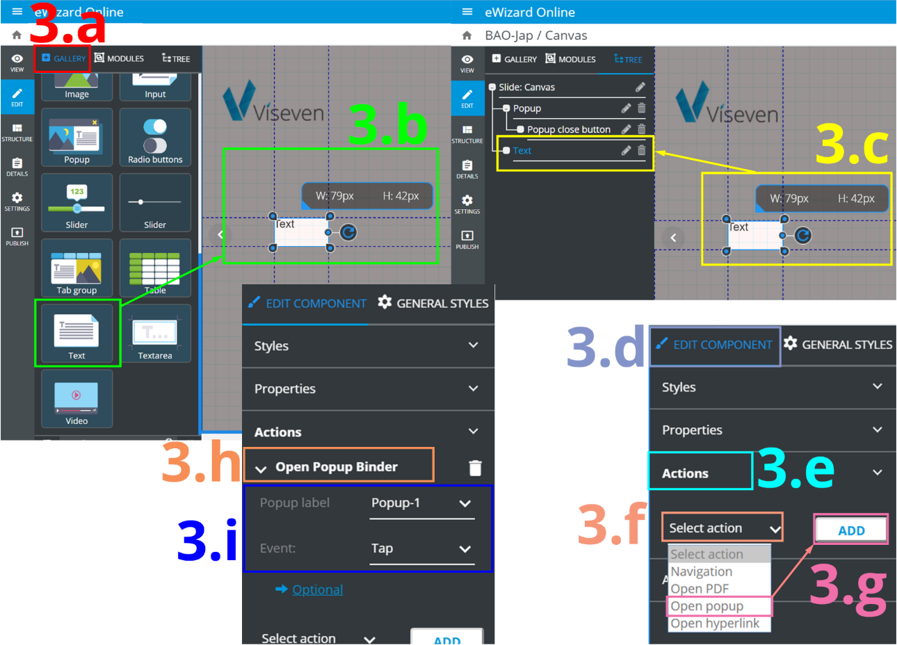
a. Go back to
Gallery.b. Find the required component (Text in our example) and add it to the slide.
c. Go to
Treeand highlight the component you have added (Text in our example).d. Go to
Edit component.e. Unfold
Actions.f. Unfold
Select action.g. Select
Open pop-upand clickAdd.h. Click
Open pop-up binder.i. Click
pop-up label, select your pop-up from the list and bind it to theEvent(Tap in our example).
Once you go to View mode and click Text component, pop-up opens.
After the pop-up is added and its opening is assigned, you can configure the pop-up according to your needs.
# Pop-up editing and styling
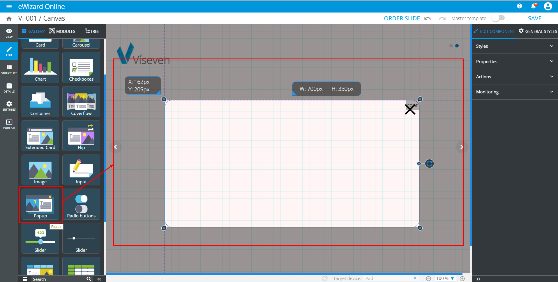
By default, the pop-up is represented by a blank rectangle with the Close button. You can place other components on it.
To add a component to the pop-up:
- Prerequisites:
- The
Pop-upis added to the slide.
- Go to
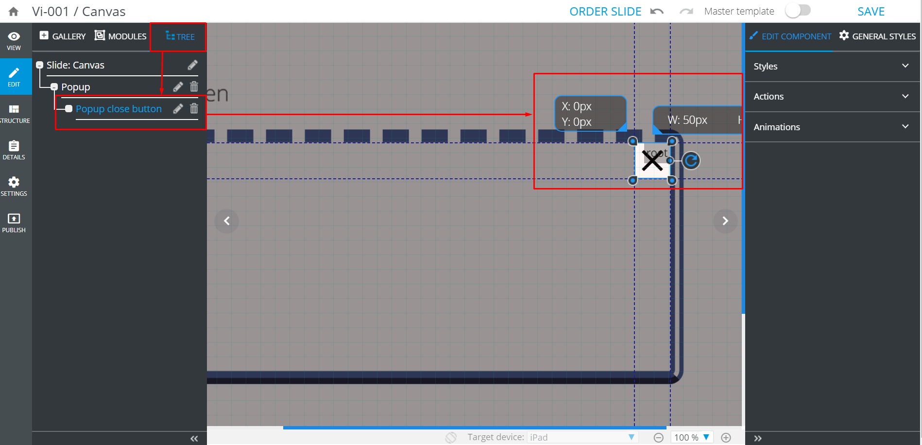
Treeand select the requiredPop-up(this makes it active).
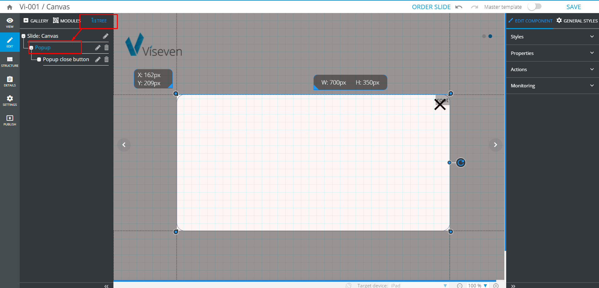
If the Pop-up is not active while you are adding a component to it, the component will not be tied with the Pop-up. To check whether the Pop-up is active, look at the pop-up's top right corner and find the root tip in the gray container:* 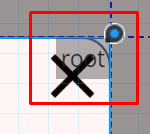
- Go back to
Galleryand click the component you want to place on your pop-up.
When you need to add more components to the pop-up, you must select the pop-up via Tree every time prior adding each new component (repeat the steps 2-3). Otherwise, the new components may be added to each other or on the other slide area.*
# Styles
pop-up can be styled at your discretion and needs. To set the component's general appearance, use Styles under the Edit component tab.
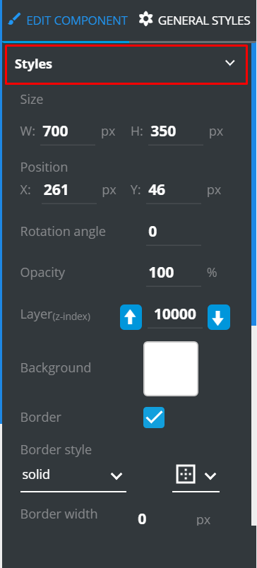
Here you can configure the pop-up's common features:
Size: Width and heightPosition: By x- and y-axisRotation angle: Its tilting about the axis, in degreesOpacity: The higher the percentage, the less transparent the pop-up isLayer: Ordering on the slide. The greater the number, the higher your component is ordered on the slideBackground: Select an image or solid colorBorders: Their presence, appearance, width, color, and radius (for rounded corners)
# Properties
Under the Properties you can edit component's title, set the visibility of the Close button and select its image, align and set its size, as well as add the animation.
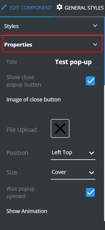
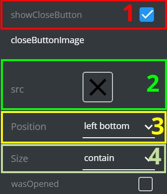
# The Close button's properties
Check
ShowCloseButtonto display it on the pop-up [1].Click
srcto upload an image of theClosebutton [2].Select its
Positionfrom the list [3].To specify the
Sizeof theClosebutton, select one of the fitting options [4].Do not change the
Was openedcheckbox settings [5]. Any changes can result in malfunction. This checkbox is used by developers.
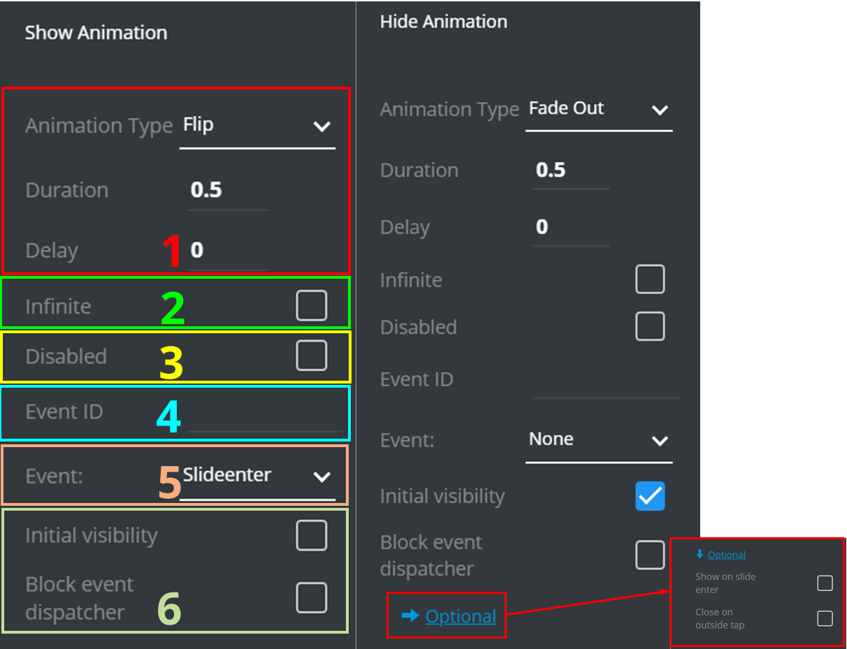
# Animation
You can assign animation to a pop-up.
Animation includes dozens of variations; each variation is individually configurable. You can trigger the animation by entering the slide or tapping the pop-up.
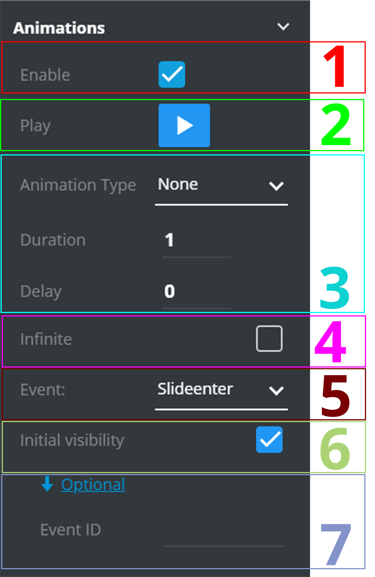
Set up
Animation Type, Duration, andDelay[1].Check
Infiniteto put animation on a loop [2].Check
Disabledto deactivate the animation [3].Enter
Event IDto tie the animation to an event by ID [4].Select
Eventto trigger the animation by one of the pre-set events [5].Do not change the
Initial visibilityand theBlock event dispatchercheckboxes settings [6]. Any changes can result in malfunction. If you need to make any changes, advise your developers team.
# Actions
Under the Actions menu you can set up the pop-up's response triggered by an Event.
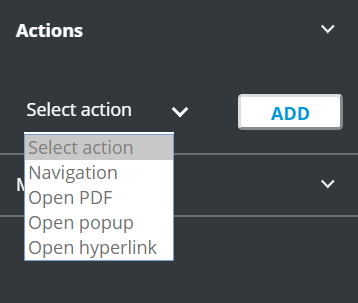
Navigationredirects to another slideOpen PDFopens a .pdf file. Having selected this option, you will be asked to attach a .pdfOpen pop-upopens another pop-upOpen hyperlinkfollows the link entered
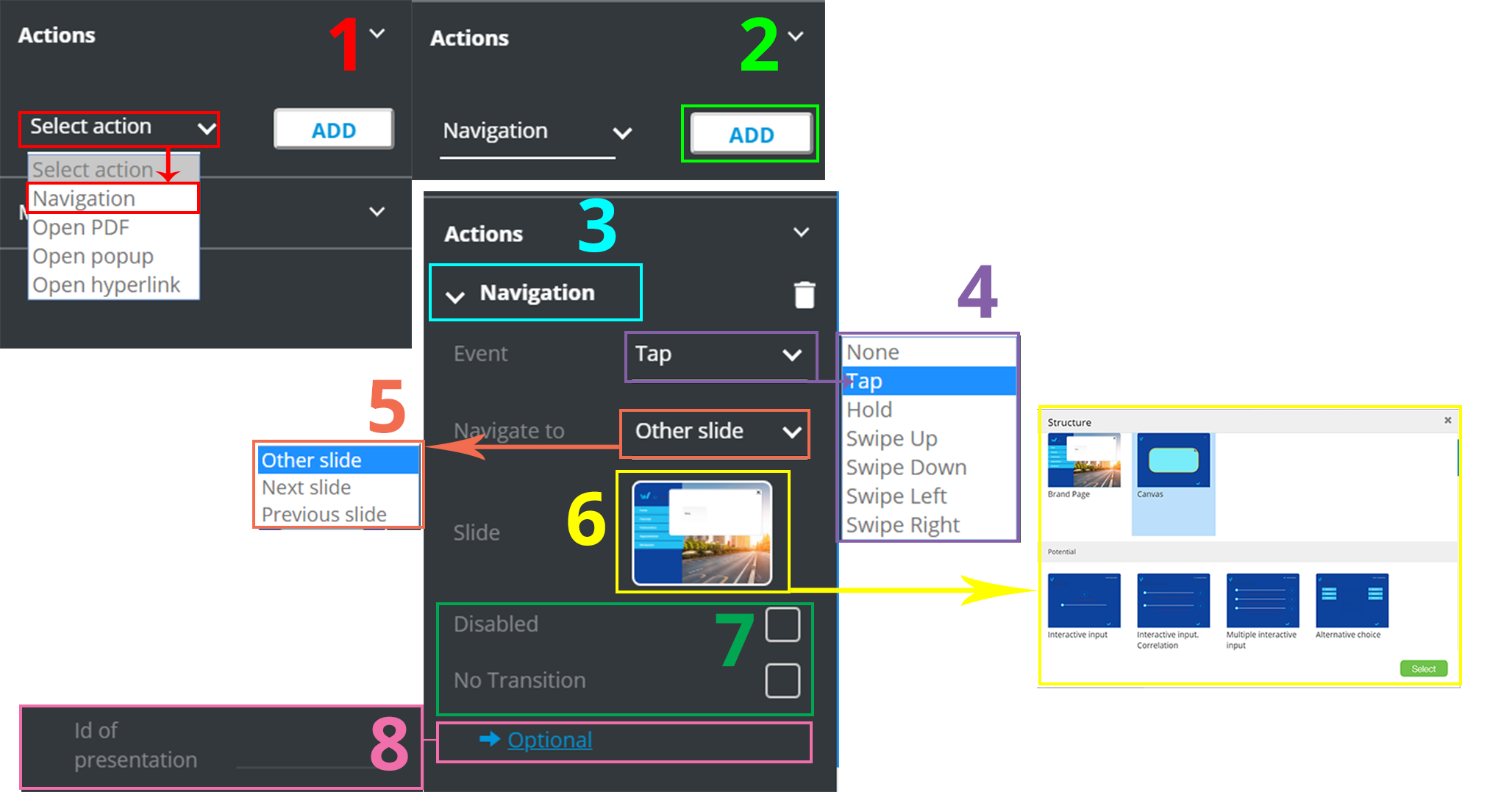
Consider the following example
Click
Select action[1] and pickNavigationfrom the list.Click
Add[2]. You can see Navigation under theActions.Click
Navigation[3] newly added to unfold its settings.Unfold
Event[4] to open the events list. - Select the required (Tap in our example).Unfold
Navigate to[5] to open the list of the destinations. Select the required (Other slide in our example).Click the slide preview and select the slide to be redirected to [6].
You can check
Disabledto deactivate the action andNo transitionto deactivate the transition animation [7].You can set the
Optionalfield [8] which isPresentation's ID. This option enables navigation between the presentations by ID. It is available in some CLMs.
# Pop-up monitoring
Since the pop-up is an interactive component, it allows to gather the analytics.
Click
Enable.Select
PropertyandCLM.Click
Add.
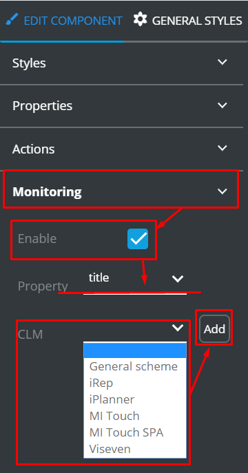
To read the tips on how to set up monitoring, read KPI monitoring tutorial.
# The Close button
Aside from the Close button‘s properties as a part of the entire pop-up, you can configure it individually.
To configure the Close button:
Unfold
Tree.Find the necessary pop-up.
Select its
Close buttonwithin your pop-up.
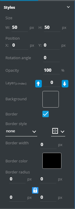
Go to Edit component and find three settings lists there: Styles, Actions, and Animations.
Under the Styles menu you can set up the button's general appearance:
Size:Width and heightPosition:By x- and y-axisRotation angle:Its tilting about the axis, in degreesOpacity:The higher the percentage, the less transparent the button isLayer:The greater the number, the higher the button is ordered on the slideBackground:Select image or solid colorBorder:Its presence, appearance, width, color, and radius (for rounded corners)
Under the Actions menu you can assign actions to the button similar to the pop-up:

With Animations you can add animated effects to the Close button.
First of all, check
Enable[1] to access the animation optionsConfigure animation: select
Type, specify the effect's Duration andDelay[3]Click
Play[2] to preview the animationCheck
Infinite[4] to put the animation on a loopSelect the
Event[5] to be a trigger for the animationDo not change the
Initial visibilitycheckbox's settings [6]. Any changes can result in malfunction. If you need to make any changes, advise your developers team.You can unfold
Optionaland specify theEvent ID[7] to tie the animation to the event by the ID
# Radio Buttons
The Radio buttons component is an interactive elements set that features buttons, each tied with a description.
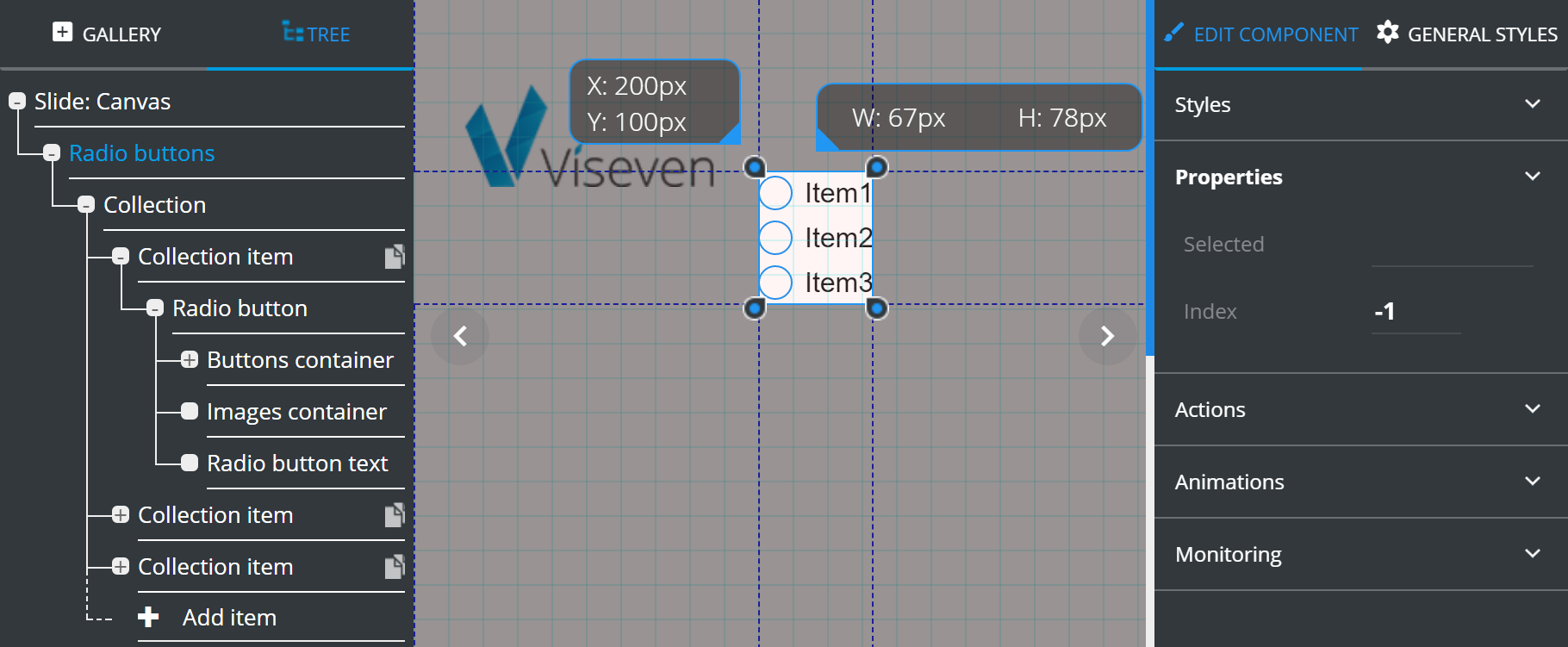
The Properties of the Radio buttons (as the whole base of the component) display summary of its current state (the Selected field and Index) and doesn't allow setting any values.
For more on the component operations see TREE chapter.
The Radio button items have almost the same Properties as the Checkbox items (from the Checkboxes component), except of the Enable images property, which is unchecked by default.
# Slider
Slider is an interactive component, which can be configured to gather KPI data according to your requirements.
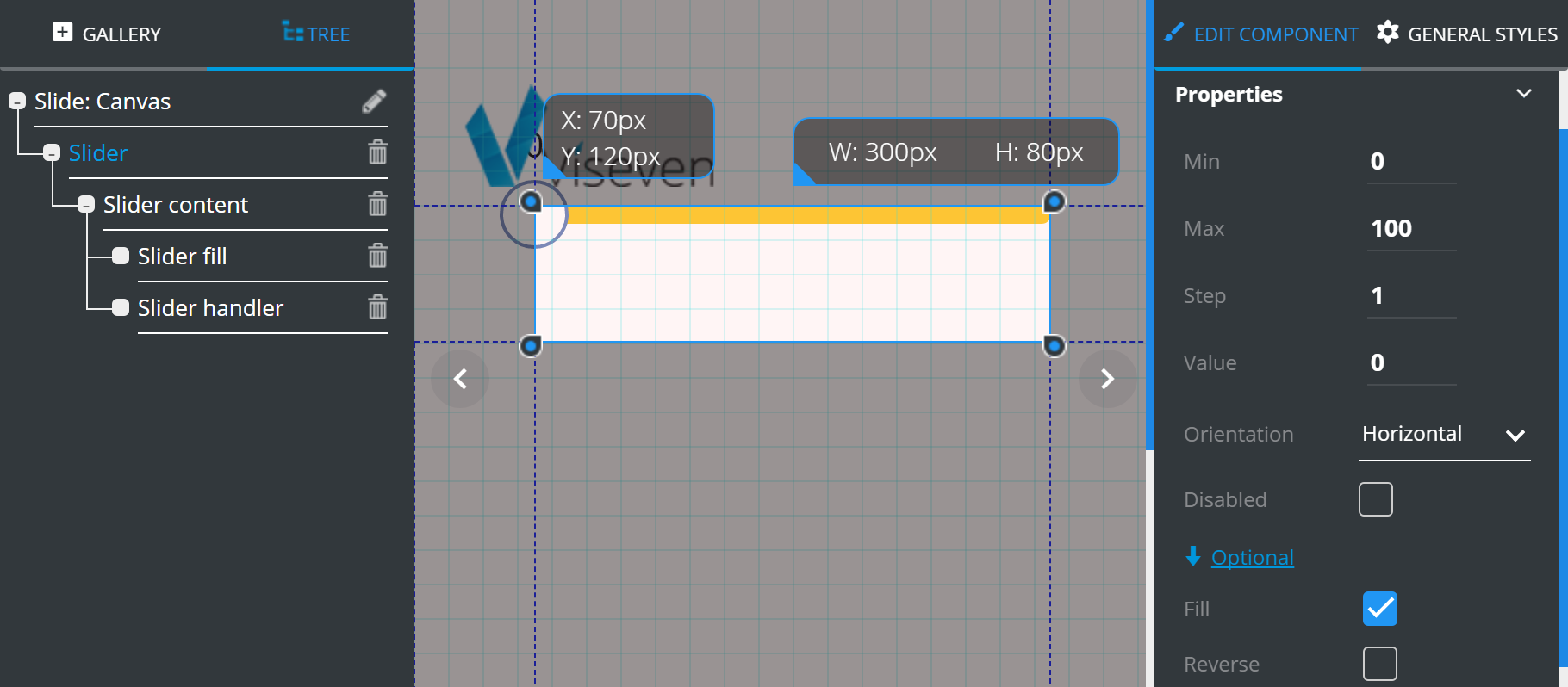
Slider has the following Properties:
Mindefines the minimum possible value of the slider.Maxdefines the maximum possible value of the slider.Stepdetermines interval between slider values.Valuedefines the slider initial value.Orientationslider orientation (horizontal/vertical).Checked
Disableddisables the input.
Optional properties contain additional features which can be customized according to your requirements:
Checked
Fillfills the selected slider part with a different color.Checked
Reverseswitches the slider direction.
# Tab group
The Tab group is an interactive component, which can be used to display information arranged into tabs. The Tab group consists of two tied collections (Navigation buttons and Tabs content). The operations with the items from one of the collections (adding or deleting the item) result in changes of its tied items from the other collection. The Navigation buttons collection items include one Text component for active state of the tab (the Active tab container) and another for inactive (the Inactive tab container). The items of the Tabs content collection include two Text components and one Image component.
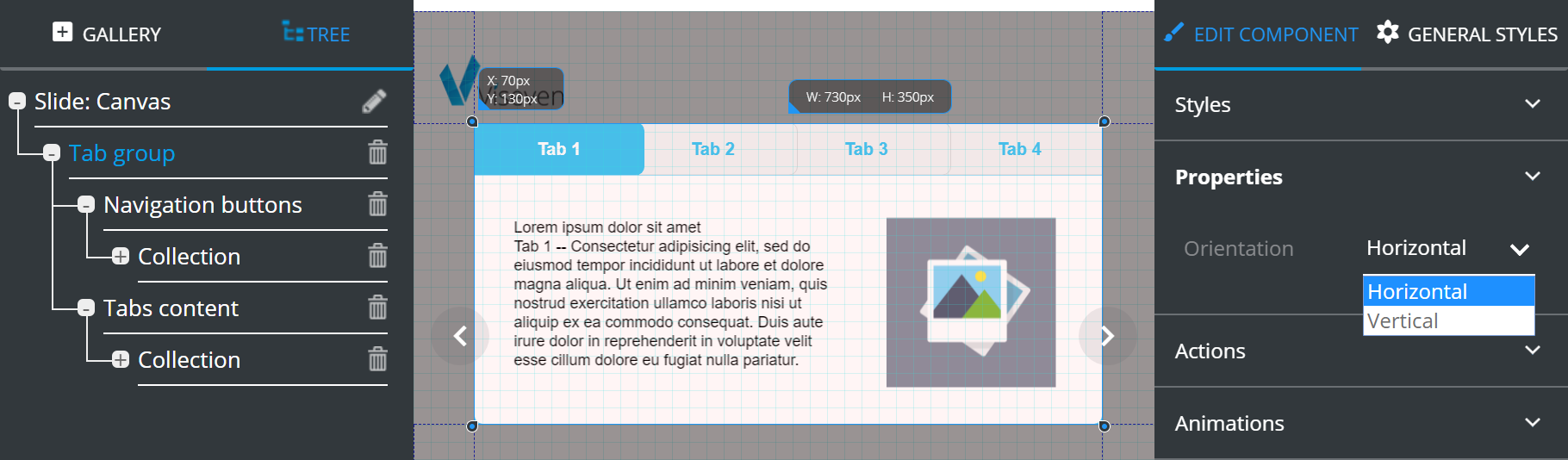
Tab group only has the Orientation property, which defines the tabs layout.
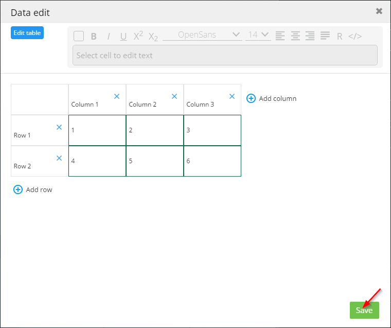
# Table
The Table component is used for adding a customizable table to a slide.
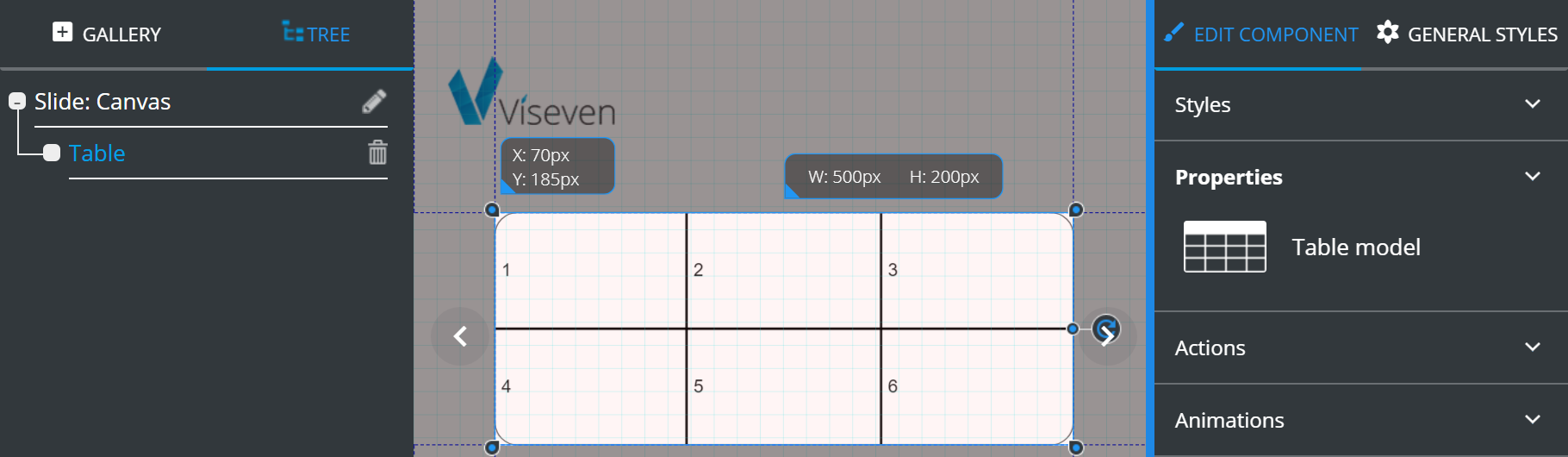
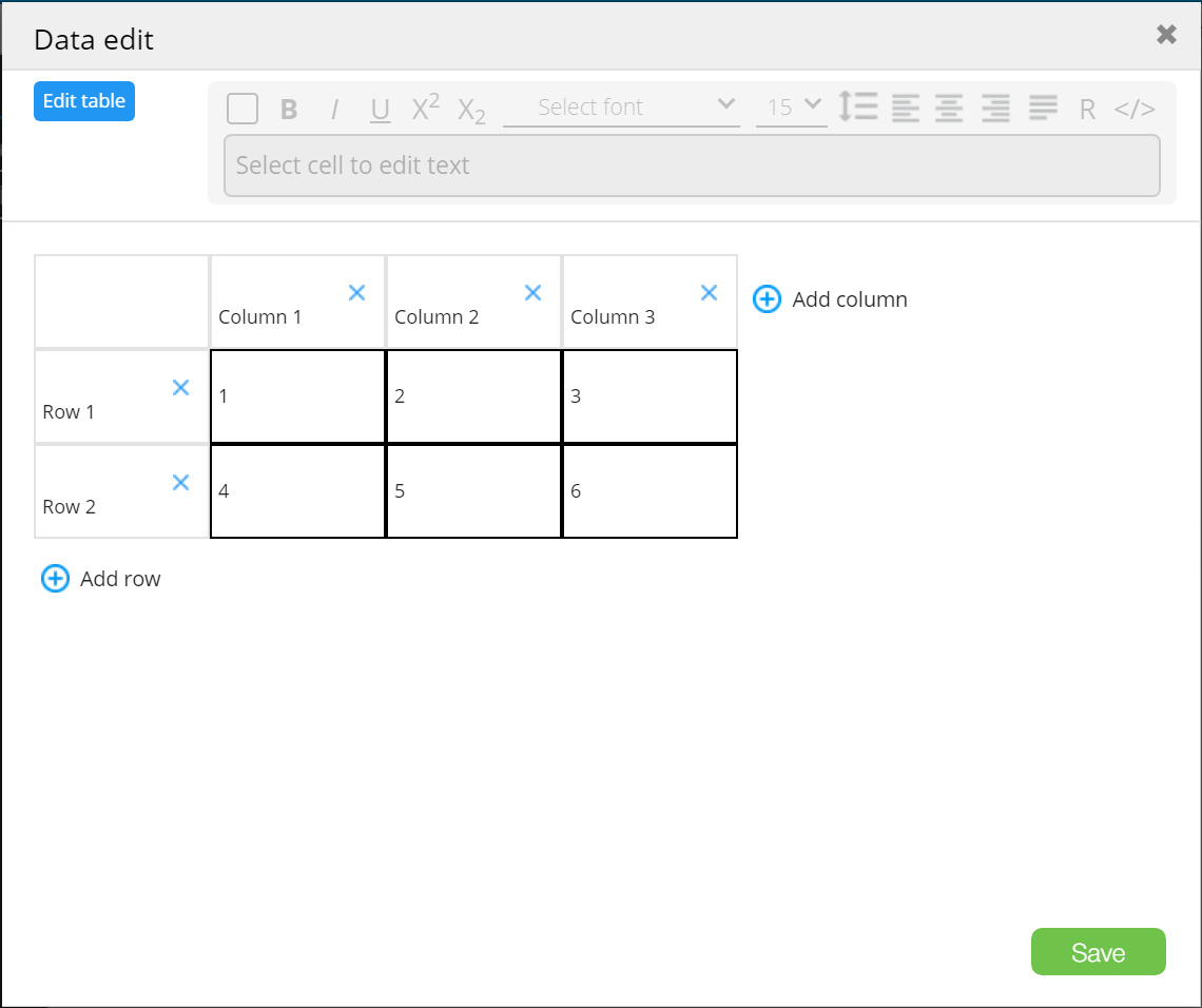
The Table model icon ( ) opens the
 Data edit form with tools for the table customization:
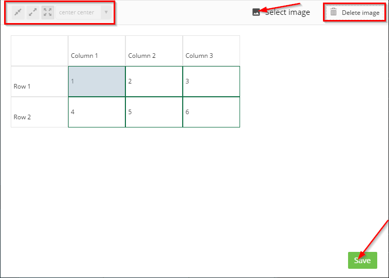
Edit table opens a toolbar that contains:
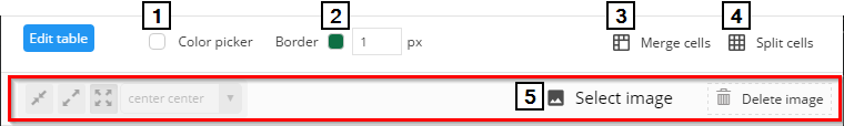
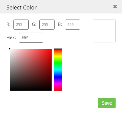
Color picker– fills the selected cell (or group of cells) with the required color.
Editing border color and width.
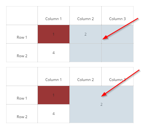
Merge cells– merges selected cells:
Split cells– splits merged cells.Select image– serves to insert an image fromDigital assetsinto a cell or a group of merged cells. Presented tools allow customizing the position of your image.Delete imagewill delete the selected image:
To go back to adding rows and columns, and entering information into your table, click Edit table once more.
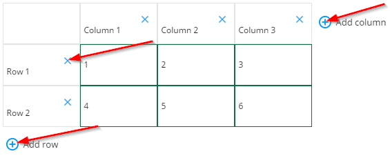
Once the editing process is done, click Save.
# Text
eWizard Editor features a user-friendly visual text editor. To activate the editor, add the text component to the layout, go to the Properties tab, and place the cursor inside the text box:
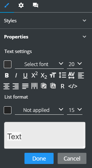
Alternatively, double-click the required text component on the slide for its inline editing:
The text editor contains the following sections:
Text settings– to apply the basic editing and customizable tools.List format– to arrange your text in a list.
Consider the following customizable features in the table below:
| Click | To |
|---|---|
 | Paste the text with a copied format |
 | Paste the text only |
 | Enter References and Design |
 | Edit the text as the HTML code |
If your browser does not support the clipboard actions, use the following keyboard shortcuts:
Ctrl+C – to copy the text
Ctrl+V – to paste the formatted text
Ctrl+Shift+V – to paste the text only
To format the list, do the following:
Select the text area in the text box [1].
Select the list type [2].
Click
Doneto apply the settings.
Also, you can change the color of bullets/numbers [3] and their size [4]:
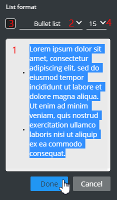
The size of the bullets and numbers is specified as a percentage of the line-height value.
# Textarea
Textarea is a component where you can enter large amounts of text.
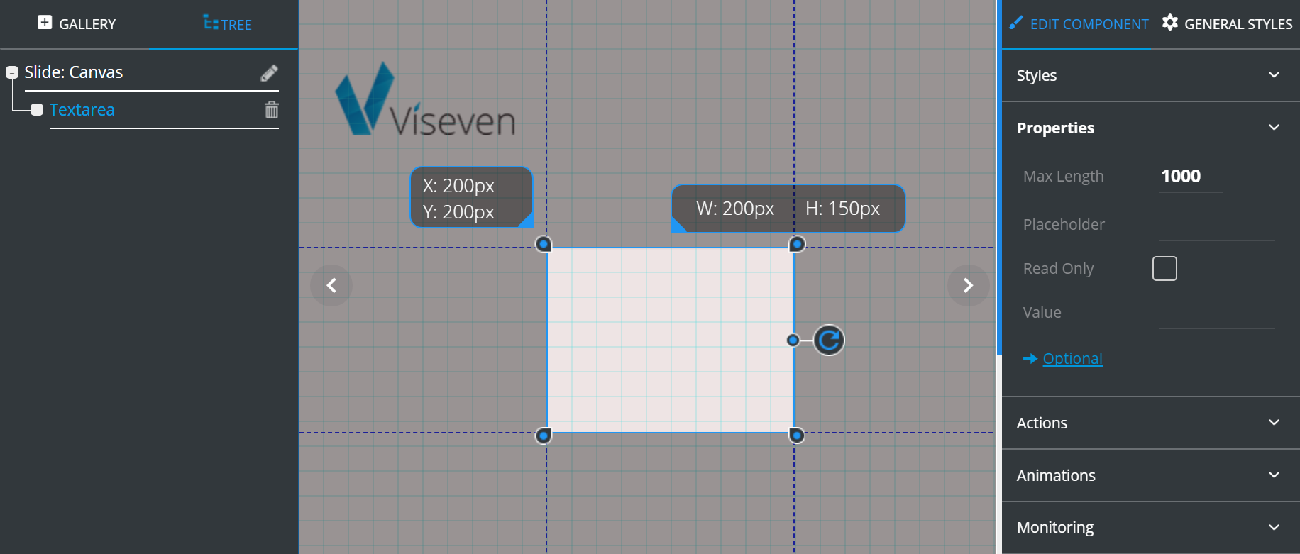
Textarea has the following Properties:
Max Lengthdefines the maximum number of symbols that can be entered.Placeholderis a text tip that is displayed in the empty field.Checked
Read onlymakes theInputelement unavailable for editing.Valueis the information to be displayed inside theInputelement.
Optional contains additional features which can be customized according to your requirements:
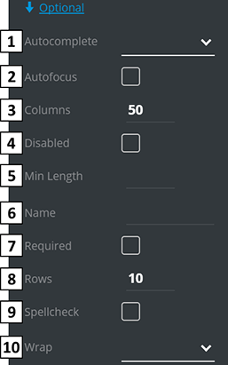
Autocompleteturns the autocomplete feature on and off.Checked
Autofocusautomatically gets focused on the loading slide.Columnsis a field's width, in symbols.Checked
Disableddisables the interactive element.Min lengthis the minimum number of symbols that can be entered.Nameis Textarea's title for Monitoring setup.Checked
Requiredmakes the Textarea field obligatory.Rowsis field height in rows.Checked
Spellcheckenables the spellcheck in the field.Wrapdefines wrap behavior. By default it isSoft.
# Video
Video is an interactive component, which allows to play video on the slide.
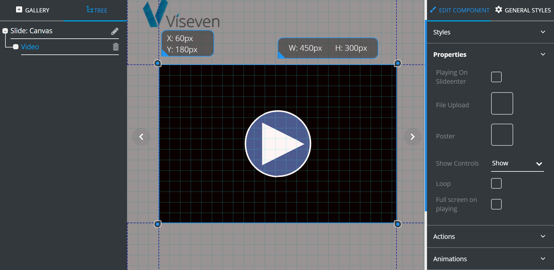
Video has the following Properties:
Playing on slideenter– if enabled, the video starts playing automatically once slide loads.File upload– tool for video upload. Clicking the property icon opensDigital assetswindow where you can select and add your video.Poster– tool for image (poster) upload. -Clickingthe property icon opensDigital assetswindow, where you can select and add a new image.Show controls– if marked, the control panel will be displayed constantly.Loop– if enabled, the video playback will be looped.Full screen on playing– if enabled, the video plays in full screen.
← Slide editing Tree →